Quantcast
Channel: architect design™
Viewing all 361 articles
Browse latest View live

Chapin Residence floorplan

$
0
0
One of my favorite books that I've mentioned before is the monograph of H.T. Lindeberg's residential work. Many of his smaller projects are shown including just these 3 intriguing photographs of a rather odd house in Lake Forest, Illinois in 1926 for Lowell C. Chapin, Esq.
If you study the plan you'll notice that the house consists of a rather small entry vestibule and an enormous living room. Thats all for public space! A warren of servants quarters fill the remainder of the first floor while the 2nd floor holds 4 bedrooms. Strange but ultimately practical.
And as you can see the 'simple' house packs a lot of punch with that steep French roofline.  Rather a quirky house and it leads me to wonder how it has changed over the past 90 years or is even still extant.

Let there be light

$
0
0
One of the most underrated light fixtures in my humble opinion is the sconce. Mounted at eye level sconces create flattering light unlike the shadow lines created on ones' face from overhead lighting. Also, they don't take up precious table space like lamps or clutter a room like floorlamps.
This weekend I helped a friend install some antique sconces we had picked out at Artisan Lamp (my favorite lighting source here in DC) onto some existing built-in bookshelves in his den. The effect is magical particularly in this small room without any existing lighting!
Not only are they the jewels of the room, the warm light cast by them is ultimately flattering and practical. Don't forget sconces in your next project!

Accents of color

$
0
0
The spring/summer 2014 issue of New Old House magazine features a new house by architect Rafe Churchill  that is traditional in its detailing, spartan even, but modern in its outlook. Most striking to me was the use of color throughout the house.
Today the norm is white or cream painted trim in every room right? Any color in this generally seems strange or odd. Not quite that long ago colored trim was commonplace and it's a device interior design is missing today. Even in my 1930s apartment I discovered all of my trim had originally been a bright turquoise while doing some work!
 I especially loved this screened porch -my favorite 'room' in the house.
 The cheerful apple green paneling in the family room is cozy, charming, and eye catching.
 The dining room features mustard yellow trim with white walls that tie into the kitchen.
Upstairs paint is taken to another level with glossy white painted floors in this bedroom. Interestingly while the trim is also painted a soft green, the door is left the natural wood.
Even this unusual 'country mancave' as I refer to it features dark painted trim, albeit with exposed stud walls. I'm not sure I'm brave enough to risk this much color in such a way in my own home but would you, could you?  Maybe we should all take a clue from the not so distant past and skip the white trim for awhile.
All images by John Gruen

Those trashy Greeks.....

$
0
0
No the title is not meant to be derogatory but hopefully it caught your attention!  Rather, how fabulous is this trash can in the "Greek style" from the 1967 movie Playtime. I watched this movie last night at the recommendation of professor Michael Djordjevitch from the NYC Beaux Arts Atelier. If you get a chance the Atelier is a wonderful organization which gives intensive courses in classical architecture and drawing ranging from 1 week intensive courses to 1 year programs (I've been meaning to take the 1 week course myself). The movie is notable for its intricate and daring sets which are a riff on modern architecture and urban planning -they make this funny movie all the better (thro.out greek style)! Be sure to add Playtime to your netflix queue, you won't regret it.

Design is all in the details

$
0
0
As Mies van der Rohe was fond of saying, 'God is in the detail'; a quote often attributed to him but in fact  much older. Details have been on my mind lately as I'm currently reading Phillip James Dodd's book "The Art of Classical Details" which I would whole-heartedly recommend to all of you.
While walking around the city the other day I was looking at some of the quieter buildings that normally would be under my radar and noticed that some of them had ravishing details. This brick townhouse below is almost a pattern book for a Victorian brick maker. All of that detail is of brick -such unusual shapes!
This iron railing seen below had amazing curvaceous brackets -simple but lovely. On buildings such as a standard row-house these details make all the difference and have stood the test of time. Have you seen anything that has caught your eye lately? What did we do before camera phones to capture our visual world?

Do you layer?

$
0
0
I think the most interesting rooms are layered with finds, accumulated over time, and not 'designed' all at once. This past weekend I picked up a pair of antique Italian gilded wall brackets to hang between the windows in my living room and display some white porcelain.
The treatment of this large set of windows has been kept simple to maximize the view of the park across the street (just one large bamboo shade to cover all 3 windows). I think the brackets add some interest to a rather window treatment -what do you think? too much?
My hope is that the simple lines of the porcelain detract from the ornateness of the brackets. But it's my own house so of course I can be as fussy as I please ;-)

Classical Invention on the Hudson River by John Murray

$
0
0
Architect John Murray is no stranger to most style-minded classicists after his monograph,' Classical Invention', flew off shelves and onto design bookshelves everywhere. I recently heard him speak through our local chapter of the ICAA and his intelligence and beautiful work go hand in hand.
While flipping through the most recent issue of New Old House magazine I came across a renovated country house Murray completed on the Hudson River that made me feel instantly at home. Murray enhanced the existing house in such a way that one doesn't know what is old and what is new, one only knows that it is RIGHT.
 The floorplan is a dream come true for most of us I would imagine; The only thing missing is the river view!
 French casements open completely to bring in the river views and air. The century old beams are the only decoration needed architecturally, interior designer Sam Blount provided the rest.
 The kitchen has all of the modern amenities of a new house and the charm of the old house.  Again I love the french casements!
The screened porch can be used year round. And what is a screened porch without ceiling fan and sky-blue beadboard ceiling?  This definitely ranks among my country house dreams -how about yours?
All photographs by Durston Saylor from New Old House magazine, Spring/Summer 2014

Oak Hill Cemetery: a city respite

$
0
0
Spring in Washington is a glorious thing but how does one enjoy it when our parks and streets are flooded with tourists? One of the best places to experience the season's flowers away from the crowds is Oak Hill Cemetery in Georgetown along Rock Creek.
With unfortunate limited hours this ancient cemetery is as pretty as nearby Rock Creek Park if not better. Flowering trees and flowers are in abundance along the steep terrain.
Established by an act of Congress in 1849 the cemetery is home to many notable names which fill history books.
As any long time reader of this blog will know I've always loved old cemeteries as examples of mature gardens and have blogged about many (Allegheny Cemetery and Egyptian Avenue are 2 examples). This one ranks up there among the most charming that I've visited.
 I love this mausoleum in the form of a stately Greek temple atop one hill.
The older tombstones have so much more character than the granite blocks one uses mostly today.
The hand chiseled calligraphy on most is astounding in this age of machine-age engraving. It's interesting to see how the different stones have aged over time: marble, granite, sandstone, etc.
 My favorites tend towards the simple tombstones such as this scroll (is it morbid to have a favorite?).
If you can find the time in your schedule to align with the cemeteries open hours I highly suggest a visit! Information on the Oak Hill Cemetery website.


The Architecture of Diplomacy: The British Ambassador's Residence in Washington

$
0
0
While I prepare a series of lengthier posts I wanted to share with you an astonishing new book that has recently been released, The Architecture of Diplomacy: The British Ambassador's Residence in Washington.
I was fortunate enough to receive an invitation to a media preview of the book as well as a tour of the residence by the authors as well as the Ambassador, Sir Peter Westmacott, and his wife Susie.  I pass this famous structure by one of my favorite architects, Edwin Lutyens, weekly but had never been behind the iron gates. Needless to say it was a thrill!
I wanted to wet your appetite with these gorgeous photographs from the book by photographer Eric Sander before sharing with you my own detail snapshots and information about this extraordinary house in later posts.
The main stair-hall has a very 'on trend' gallery of stunning prints from the UK Government Art Collection. Far from a new decorating device however, these gallery walls are a contemporary interpretation of the print rooms interiors that were popular in British country houses from as early as the 1750s.
So much to take in; the railing, the stone stair, gallery wall. The 118 framed prints feature portraits, country houses, botanical specimens, animals, views of London, cathedrals, churches, castles, as well as images relating to the embassy itself.
Built as an embassy in 1930 (unlike most current embassies in this city) this is naturally the perfect party house. The main floor is 1/2 circulation space with the other public areas consisting of a grand ballroom, seen above, a drawing room and a dining room.
 Every room is picture perfect, even the private study of the ambassador above.
 The last public room is of course the garden. I look forward to sharing much about this as well.
My favorite room, and probably the most stunning stair I have ever seen, was the private stair up to the 2nd floor where the ambassador's apartment and guest rooms are housed.
The book contains many more inspirational images that won't disappoint: definitely add this tome to your design library! Stay tuned for more details of the British Embassy.
All photos courtesy of Eric Sanders from The Architecture of Diplomacy.

The most beautiful stair in Washington: Lutyen's British Embassy

$
0
0
My favorite part of the tour of the British embassy was seeing the small private stair which leads from the public rooms to the private spaces of the residence; this is probably the most beautiful stair I've seen in DC.
 Lutyens took particular care with his staircases as he enjoyed the drama and panache they provide to any structure. Here he took a circular stair one step further by incorporating a circle into the iron handrail.
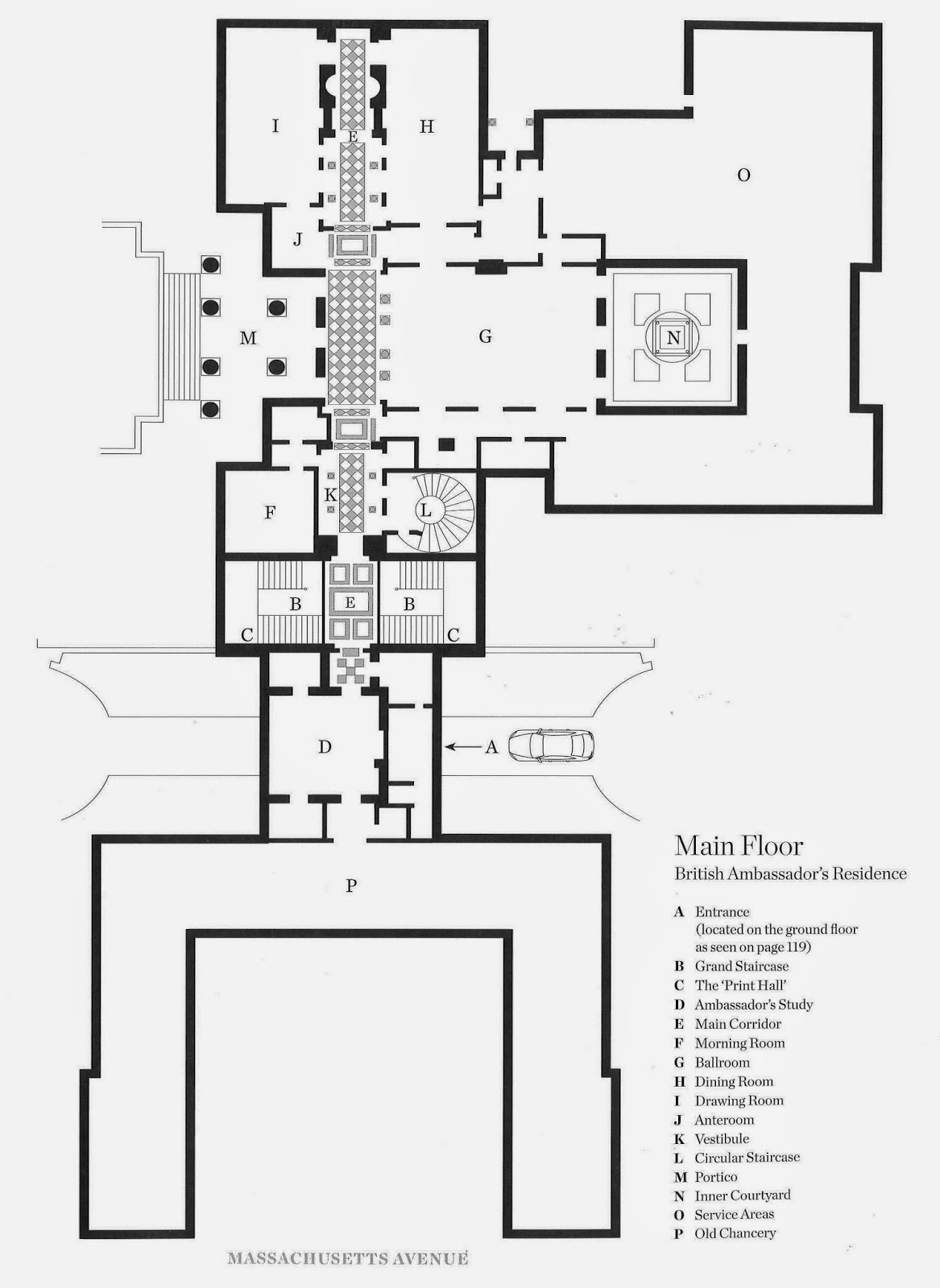
The floorplan above shows the location of the private stair (L). The circle made for a compact stair that could fit to the side of the public circulation.
The treads are limestone cantilevered (in parts) from the limestone walls. To provide a graceful ascent Lutyens designed many of his stairs with very short risers and long treads.
 Displayed in the stairwell is this colorful silk banner of the Royal Arms once owned by William  IV.
 A window on the 2nd floor allows natural light into the space.
A very regal portrait graces the top landing - Queen Victoria perhaps? I'll share a very different stair from the house shortly, the Grand staircase.
Floorplan from The Architecture of Diplomacy, The British Ambassador's Residence in Washington. Photographs are my own.

Lutyen's British Embassy: Main Stair

$
0
0
The main staircase at the British Embassy was designed by Lutyens to awe all visitors and make a grand statement. The entrance to the embassy is somewhat discreet.
One arrives underneath a classical porte cochere in the center of the complex (underneath D on the plan above) and into the main stairhall; the residence is a piano nobile design which cleverly aids the hilly topography - but we'll get into that later.
Symmetry and classical design reign on the exterior; a rather quiet facade gradually gives way to grandeur as one enters the residence.
Many of the light fixtures throughout were custom designed - the fluorescent light bulbs are really unfortunate but do not hurt the fundamental beauty of the lantern.
 Upon entering through french doors directly to one's left is a bust of the architect, Edwin Lutyens.
 Light pours into the lower level from windows above inviting one up. Further emphasizing this ascent are the walls which turn from heavy Indiana limestone to a lighter plaster.
 I loved the cascade of the lower risers which leads one to a short landing and the cloak rooms.
The most impressive detail of the space is the railing itself. Below is a sketch by Lutyens from early on in the design in 1925.
As you can see it didn't change much. This motif graces the endpapers of the new book on the embassy as well; The Architecture of Diplomacy.
 I love the furnished landings and I'll again point out the print gallery walls as well, installed in 2012.
Symmetry is key in the stair hall as throughout the residence. The interior window below to the right opens into an interior room: the morning room. Lutyens commonly designed such interior windows into his residential projects; supposedly so children could watch the festivities during parties!  A false mirrored window stands opposite the landing to attain this perfect symmetry.
 The placement of these ginger jars is perfection.
The ladies cloak room off the stairhall features Fornasetti's very stylish 'Teatro' wallpaper -manufactured by a very British company naturally, Cole & Son. I loved these lanterns which flanked the opening.
The entry to the public spaces of the residence feature ornate plaster-work as well as lovely urns on pedestals.
 A closeup of the plaster work reveals native flowers with classical figures.
Join me in following posts for more on the public spaces of the British Embassy.

John Russell Pope tour and an upcoming ICAA event

$
0
0
I recently had the honor to host a lunch time tour of the John Russell Pope designed National Gallery of Art for the Mid-Atlantic branch of the ICAA of which I sit on the board.
Probably my favorite public building in a city of favorites, this classical gem was designed by architect John Russell Pope for Andrew W. Mellon. Mellon (basically and in short) gifted the building and the basis of its collection to the nation. In an odd twist of fate both Mellon and Pope passed away in August,1937 before the Galleries' dedication in 1941.
Clad in Tennessee pink marble the Neoclassical structure harkens the growing trend towards modernism while still looking to the past, as does much of its' collection.
Below you can see some early sketches by Pope which show the partee or basic plan as well as the massing of the building.
Largely based on Rome's Pantheon with wings housing the galleries, the structure incorporated the latest technology of the time which has held up remarkably well considering the wear and tear the building receives on a daily basis (including a recent earthquake)!
The central rotunda is my favorite space in the museum and possibly the city. The columns surrounding the central fountain are solid marble (quite the engineering feat getting those into place) which visually support a large coffered dome. While appearing to be the same stone as the rest of the interior, the dome is actually composed of plaster with a steel frame.
Indeed the entire structure is concrete and steel based with a very (modern) veneer of marble. It hides his secret well.
On either side of the rotunda are 2 skylit sculpture courts. As throughout the museum most spaces on the piano nobile are daylit by large skylights.
 The building itself is an encyclopedia on classical detailing.
I love this bronze lantern in one of the vestibules -notice the Greek key and architectural motifs.
The openings in the galleries themselves are clad in different materials -here in Italian travertine with silk damask walls (dating to the 1980s)
Seen above the current chief architect for the museum, Susan Wertheim, talks to the group about the Pantheon influence in front of Panini's painting, Interior of the Pantheon.
Speaking of classical detailing the ICAA has an upcoming lecture by Phillip James Dodd centered on his new book The Art of Classical Details on Thursday, May 22nd - a fascinating lecture not to be missed!
Information and tickets to the lecture can be purchased from the website; look towards the bottom of the events page linked HERE. Hope to see you there!

Lutyen's British Embassy public spaces

$
0
0
The public spaces of Lutyen's British Embassy exemplify the British Country House look; grand, luxurious with an aire of informality, and above all Classical, albeit with a twist.
After ascending the Main stair one is confronted with a long corridor that creates the spine of the house. This axis is meant to impress the visitor, leading one to believe that the house is much larger than it actually is, while also providing ample room to entertain.
One can follow this strict axis in the floorplan above.  Much in the Beaux Arts mode, the initial spaces are where no expense is spared and the details are ravishing.
These plaster capitals, moulding, and scagliola columns would not escape the notice of the most ardent non-aesthete.
The ballroom is not hidden behind doors but rather creates a cross-axis with the corridor. Notice the Warhol portrait of Queen Elizabeth II above the mantel. The mirrors with mounted crystal sconces were my favorite part of the room. Original to the space they had been removed for decades before a previous ambassador had them re-installed.
 The level of detail found in these 85 year old plaster mouldings is impressive; no over-painting regimen here!
After the ballroom one approaches the large corner drawing room, with multiple seating groups, which faces the beautiful lawn and gardens.
 As can be expected in a house with this many large windows the quality of light is beautiful.
Opposite from the drawing room is the dining room. Again the corner location makes for the best use of light even with the opulent curtains.
These crystal girandoles flanking the mantel were show-stoppers. The mantel had been painted gray until one day a painter noticed that it was made of an orange scagliola;  the paint was judiciously removed from the columns and direct fire surround for contrast.
My favorite shot I took in the house, and which sums up the entire British attitude towards such grandeur, was this table lamp in the dining room slightly askew;  Modest to a fault.
While I took hundreds of photos I have to leave some of the house a mystery so you check out the amazing book which was the purpose for my tour: The Architecture of Diplomacy: The British Ambassador's Residence in Washington. Above and in the first photo of this post you see images of the ambassador's private study which artfully bridges what was once the connection between the residence and the embassy.
No Englishman's study would be complete without a bar: this one complete with a portrait of Field Marshal Montgomery, expertly painted by President Eisenhower in 1952. And not to fret, while this may be the only general overview I'll post on the interior of the house (really, get the book as my images could NEVER compare), I still have stunning details to bring you from Lutyen's American Masterpiece: The British Embassy.

Architectural Models from Chisel & Mouse - now in miniature AND Frank Lloyd Wright

$
0
0
I recently found out some very exciting shopping news that will have many of you reaching for your wallets: One of my favorite companies, Chisel & Mouse that produces architectural models, has expanded their line to include not only miniature models but also projects by Frank Lloyd Wright!
I was surprised to arrive home last week and find a large box from sponsor Chisel & Mouse with 4 samples of their delightful and now miniature models.  All four are of well known Frank Lloyd Wright projects here within the United States.
The first I'm showing here in 4 different locations throughout my apartment is the V.C. Morris Gift Shop in San Francisco (that I'm very excited to be able to visit while on vacation in California next week!). Expanding on their idea now that many of their models can be wall mounted (as shown above) all of these include a discrete hanging spot on the back for easy display.
The wide base also allows them to sit on a mantel, bookshelf, nestled in a tablescape, desktop, or wherever you choose.
 I think their best seller will probably be this highly detailed model of the NYC Guggenheim Museum.
One of the most impressive projects by Frank Lloyd Wright is his Unity Temple in Oak Park, IL which I visited while in college.  Here you see it resting on my bookshelf where all 4 models have ended up -an impressive collection.
I think these miniature models make the perfect host /hostess gift and just in time for summer houseguest season!  Check out these and other models on their website: Chisel & Mouse. Tell them Architect Design sent you and receive a 10% discount with code "arcdesign"

Those fine 'Fine Paints of Europe'

$
0
0
As an architect you constantly find yourself specifying interesting and beautiful products but how does one get to make an educated decision over which products to use? I decided to try one out myself - Fine Paints of Europe. Fine Paints of Europe, or FPE as I'll call it in this post, is an oil based paint renowned for its glossy, almost glass-like appearance. To achieve this shine a rather detailed process is involved and on a recent project I decided to try it myself rather than leave it to the painters so that I could really get to understand the process.
Lets start at the very beginning shall we?  The project was an old and rather, lets say, 'dated' townhouse in Georgetown.  Above you can see the 100 year old door forlornly hidden behind an ugly security gate and layers of pink paint.
The first step was to get the house right. Painters were brought in to banish the pink and white scheme and new landscaping was installed. Dated storm doors in the city? No thanks, rip that out! Much better already, no?  After the long missing shutters were re-installed the only thing remaining on the street front was how to make that front door a focal point. It had to be something really special I felt - a bold color - and a shiny finish would be the finishing touch. Rather than a traditional red or green accent door, purple was decided upon. Yes - PURPLE. If you're gonna go for it - GO FOR IT!
Picking up my paint brush I was careful to follow the FPE instructions. After removing all of the brass hardware (to be thoroughly polished) and sanding the door (a very important step as the high gloss would show any imperfection), a specialty primer by FPE was used. This primer was so thick and rigid, like super glue, that it created a smooth surface to work on; not an easy feat on a rough old Victorian door! This took about 3 HOURS!! The 3 day holiday weekend was a perfect time for this as it took an entire day for the door to be sanded, primed, and then dry. The 2nd day was the 1st coat of paint.  The paint was also thick, although not as rigid as the primer. It went on smoothly and after very careful brush strokes, miraculously produced a perfect glossy surface!
The first coat dried perfectly and I was tempted to leave well enough alone but the directions said to apply a second coat. So the 3rd day I woke up early and did as directed. The 2nd coat was somewhat difficult as the paint dries as glossy as it is while wet so making sure I was achieving even coverage was a bit of a chore (viewing the door sideways helped). After drying for 12 hours I was able to re-install the now gleaming brass hardware and voila!
I was so happy with the end result and think it puts the finishing touch on this lovely Georgetown townhouse. On future projects I'll now be able to instruct painters with assurance having tried the product myself.  Lesson learned: follow the directions, they're there for a reason!
I received no compensation for this post but rather I wanted to share my experience with a great product!

Artefact design and salvage, Sonoma

$
0
0
I recently returned from a vacation to Northern California and while I organize my thoughts & photos I thought I'd share with you Artefact Design & Salvage. Artefact is a store that I came across in Sonoma thanks to a recommendation from my good friend, designer Michael Hampton.
Housed in a small district of warehouses near the Sonoma airport, the immense store carries all manner of re-purposed salvage and a lot of other quirky finds.
 One could spend hours browsing their stock and reading through the offered design books of local talent.
One will of course be greeted by Axel, the trusty store mascot! A playful dog, he will demand you play with him and his favorite toy bucket. Beware.....should you attempt to play with him, Axel and his bucket will follow you throughout the store no matter the length of your visit!
The goodies continue outside in the yard - I particularly loved this stone urn.
 This child's sled would be a charming planter or great for Christmas decorating.
 Looking for column capitals; How about a matching pair of enormous Corinthians?
 The closer you look the more you find; architectural fragments are everywhere!
This metal dormer is the real thing -often copied for use as mirror frames or such inside.
 Notice the unusual Egyptian column integrated into the wall above.
 I wish I could have packed these dozens of feet of huge Gothic revival trim into my suitcase!
 This ornate iron gate must have come from a grand estate.
 The design of this iron guardrail was probably one of the more inspiring finds.
I'm not sure how this enormous stone 'coin' from Philadelphia made it to the wilds of California but I imagine it would be great integrated into someone's vineyard!
If you find yourself in wine country don't forget to stop by Artefact and tell them ArchitectDesign sent you!
No compensation was received for this post: the pictures are my own.

Carmel cottage

$
0
0
I came across this cottage while in Carmel, California and immediately thought it was the perfect little beach cottage. A field of lavender for a front yard, climbing roses up a brick chimney, an American flag waving by the front door, wide casement windows to hear the ocean - what more could one ask for?

Legion of Honor Museum, San Francisco

$
0
0
While in San Francisco I visited one of my favorite museums which I see every trip to California, The Legion of Honor museum.  While on this trip I went primarily to see the newly restored Salon Dore and the coverage on its restoration, I was happy to revisit old favorites as well. (more on the Salon Dore in a later post).
This museum has everything going for it in my book; the architecture is modeled on the Hotel de Salm in Paris, the collections span everything from porcelain, Egyptian relics, decorative arts and paintings from the golden age of Europe, and the views of San Francisco and the bay from the hilltop location are stunning.
 The entry is a long procession between the gallery wings past one of Rodin's 'The Thinker' sculptures.
 Inside each gallery houses a different genre of art so there really is something for everyone!
Each gallery also has its own color scheme -the English Country house room is a striking red.
 One of the period rooms featured excellent natural wood and gilded boiseries.
The stunning Italian rock crystal chandelier dates to 1730 and was a gift to the museum from Madame Jacques Balsan, nee Consuelo Vanderbilt.
 I loved how the case protecting this lovely terra cotta lady allowed her to gaze upon herself in reflection.
 Rodin's works are to be found throughout the museum.
The most stunning item in the collection though has to be the polychromed Spanish wood ceiling from around 1500 - gasps are literally heard as one walks into the gallery.  Be sure to visit the Legion of Honor museum whilst in San Francisco!

Interesting lighting at Filoli

$
0
0
While in California I stopped by Filoli, a spectacular house museum that I have blogged about extensively in numerous posts HERE,  and noticed an unusual light fixture in the dining room.  The 'candles' of the sconces are torpedo shaped sleeves from which slits are hollowed out in the back to hide a much smaller bulb.
When one sees the fixture from afar they appear to be candle-lit sconces as no light bulb is visible but they still 'glow' providing ambient light.
Above you can even see how some of the sconces hold real candles while others hold the backlit torpedoes. I think I rather like this idea.  What about you, or is it trying too hard?

Filoli entry

$
0
0
The thing I adore most about visiting  house museums is checking out the amazing details caught in time. While at Filoli I must have taken 20 photos of the entryway itself!
Everyone knows the neo-Georgian front facade of Filoli from numerous tv shows and movies but it was used by Hollywood for a reason; the quiet good taste and great details just are dying to impress.
Looking up to the portico ceiling is rewarding with amazing plaster and stonework. Even the bronze lantern with leaded glass would be beautiful on its own.
Flanking the front door are antique Roman birdbaths - each slightly different but similar enough to appear a matching pair to the common observer.
Once inside even the front doorknob is a work of art, chased with detail. One small overlooked detail however: the screws are all different directions!  Horizontal or vertical I want them all to align!
The interior plaster walls are scored to resemble stone, a common technique used in my own coop building lobby.
And as everyone knows by now I adore a vintage light fixture.  These iron sconces  in the entry vestibule are also works of art.  Detail is everywhere if one just opens their eyes to SEE!
Viewing all 361 articles
Browse latest View live